|
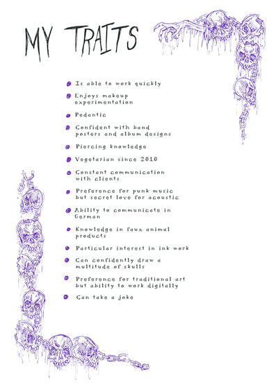
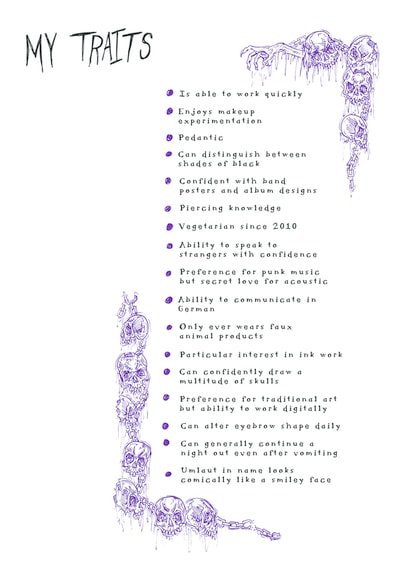
29/1/2018 1 Comment My Traits - ContinuedI was having a struggle trying to think about what exactly to put on the sheet, and how to lay it out. It seemed a bit daft to make something really elaborate so I focused on making some really simple decoration of my preference just to kind of jazz it up a bit.
1 Comment
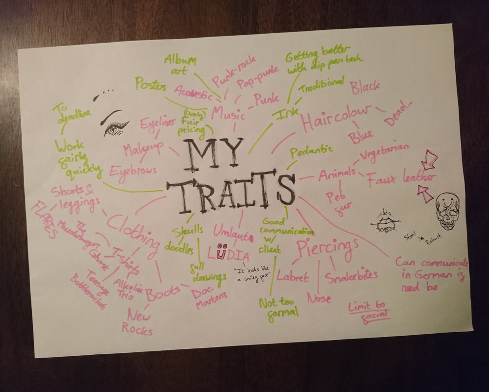
25/1/2018 0 Comments Professional Practice: My TraitsSo, we've been instructed to create an A4 sheet of our traits. This ranges from unique aspects so genuine skills. I've only just had a think about this tonight but decided to get a page of scruffy notes put down so I at least have content before thinking about how I'll interestingly lay it out. Pink is general stuff about me personally, green is career-relevant stuff.
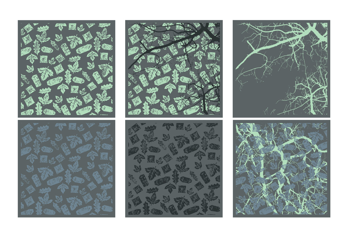
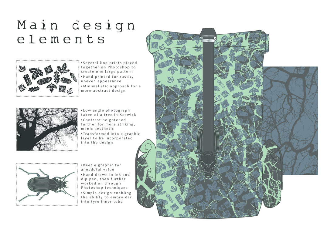
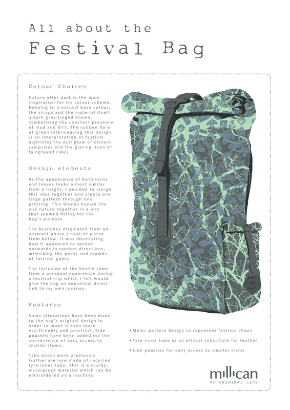
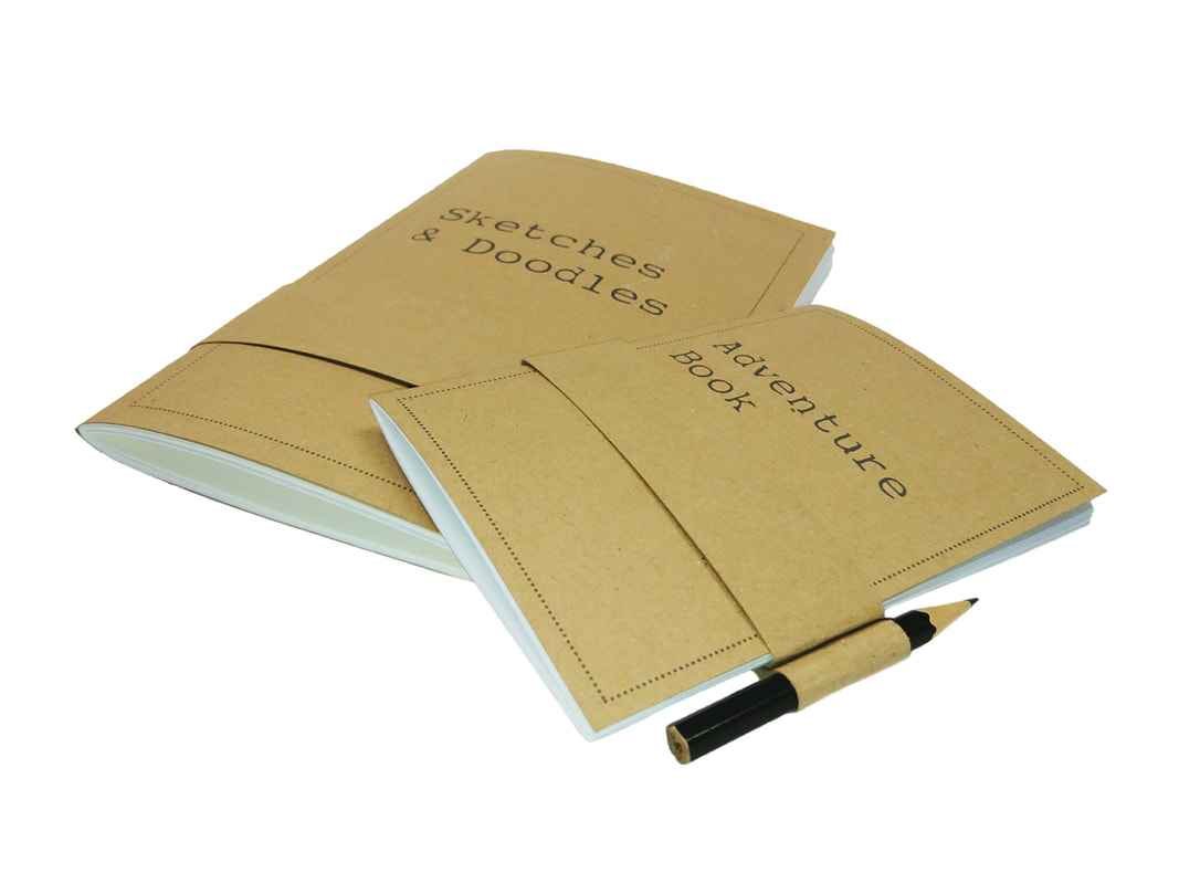
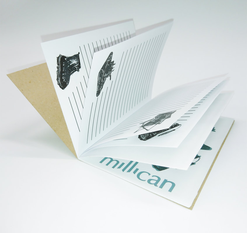
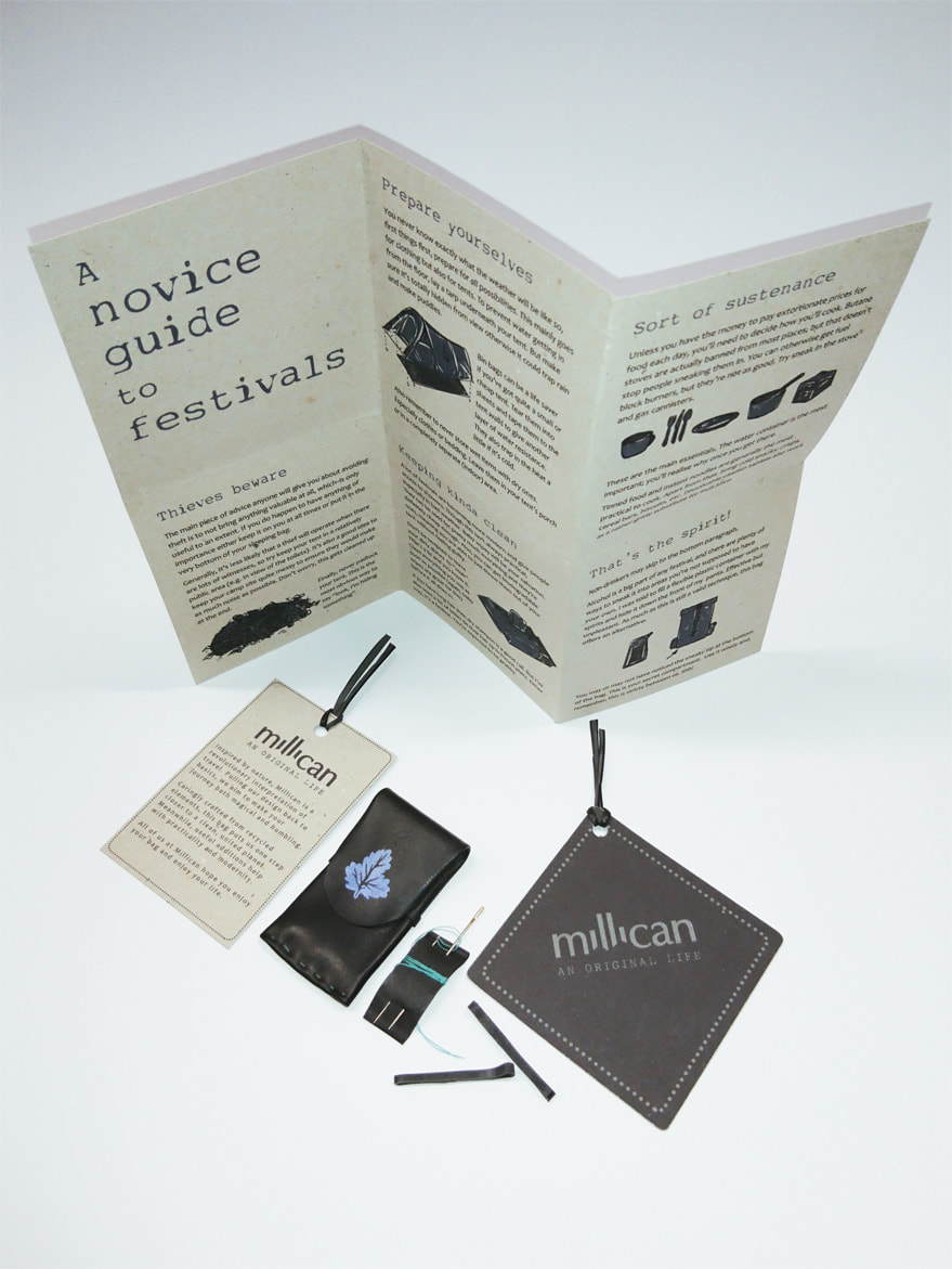
This is my first step of documenting the process. Join me on what will hopefully be a semi interesting quest. 14/12/2017 2 Comments 03: Millican Blank CanvasI thoroughly enjoyed this project right from the start. Millican is a company which focuses on creating practical but eco-friendly bags for people going on journeys: literally and spiritually. Sustainability is something I am quite interested in so I really immersed myself into this project. For example, instead of leather, I designed my bag to use bike tyre inner tubes as a substitute. I decided to focus my theme on festivals, mostly due to my own experiences. I made my own pattern of leaves and tents using lino, giving the visual metaphor of human life and wildlife intertwining. Linking with the idea of sustainability, it seemed a bit redundant to create a ridiculous amount of extra pieces to add onto this product. For this reason, I made sure the pieces I did create generally had multiple uses so they wouldn't just be needless wastage. I do genuinely think I did a good job with this project. My design reflects the chaos of festival life but still holds enough relevance to other areas of travel that it has a wide audience range. I also believe my extra pieces are functional and interesting without merely being useless pieces of paper and card.
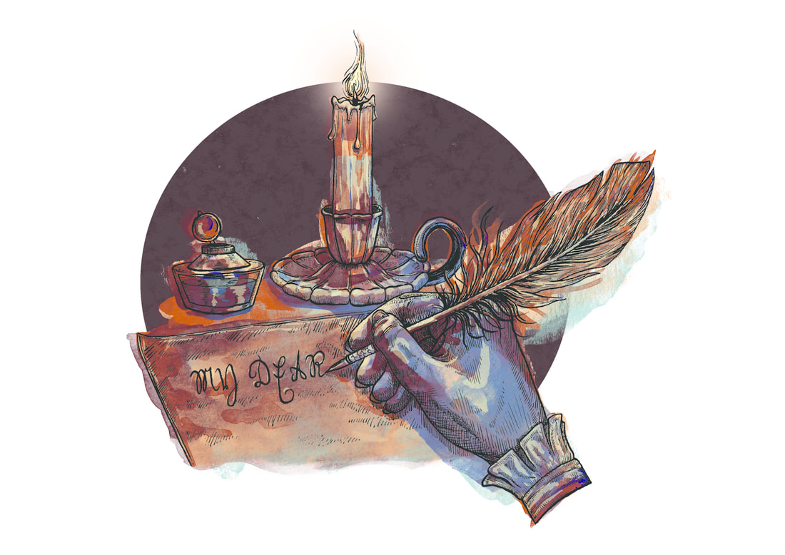
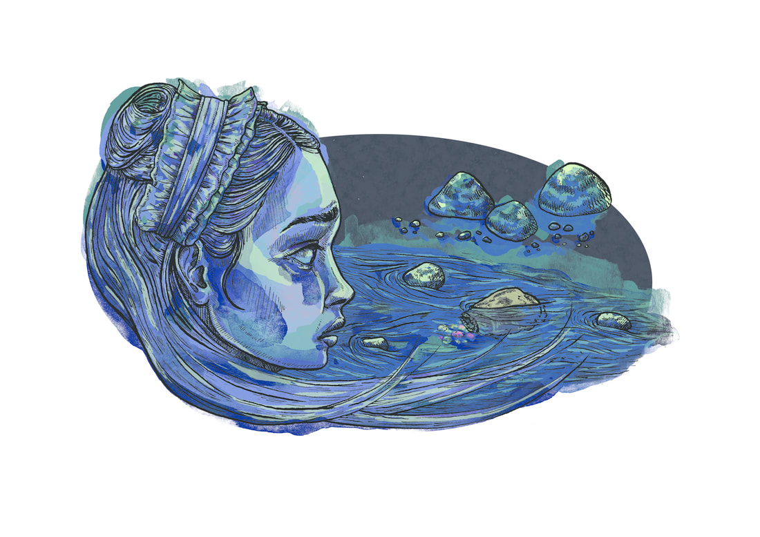
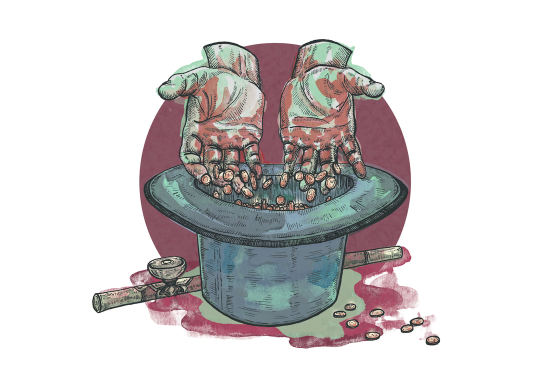
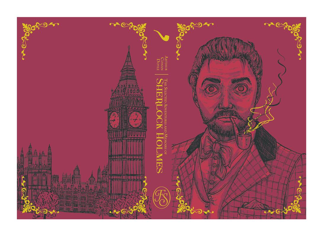
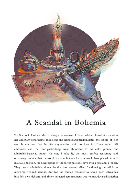
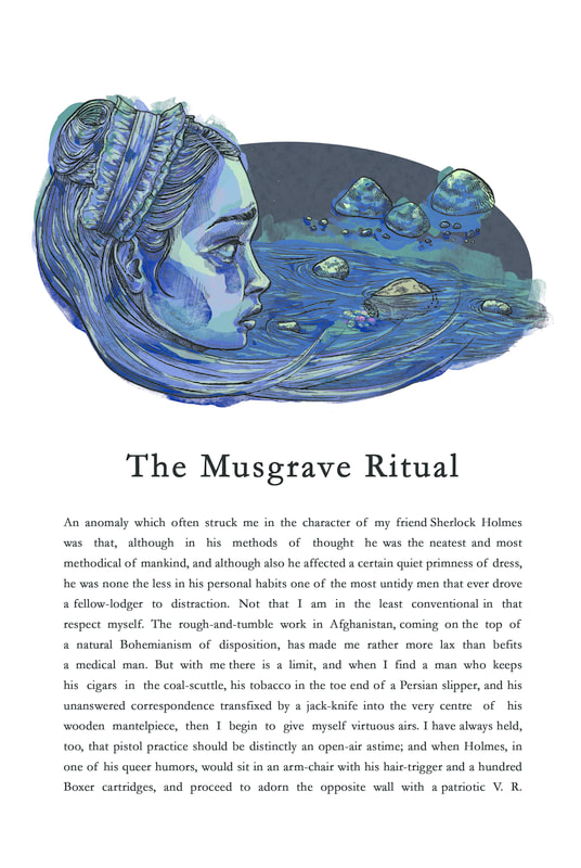
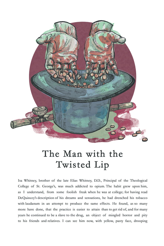
11/11/2017 0 Comments 02: Folio SocietyThe brief for this project was to create three illustrations and a book cover for 'The Selected Adventures and Memoirs of Sherlock Holmes'. I quite enjoyed the drawing aspect of this as it really allowed me to practice my skill in ink drawing much more, however I struggled a lot with colour. The illustrations' colour is built up of several layers of watercolour which I scanned in and edited separately. I did this intentionally to allow for experimentation and mistakes. I wanted to try doing my illustrations a little differently, aiming to sum up aspects of the story in vignettes which would appear above each title. Overall, I was quite happy with the outcome of this project. I wanted a completely different take on the visual expectation of Sherlock, and I think I achieved that well. I also think I need to continue working with ink as I enjoy it and can definitely see my skill progressing.
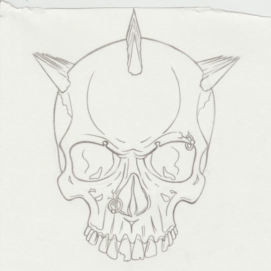
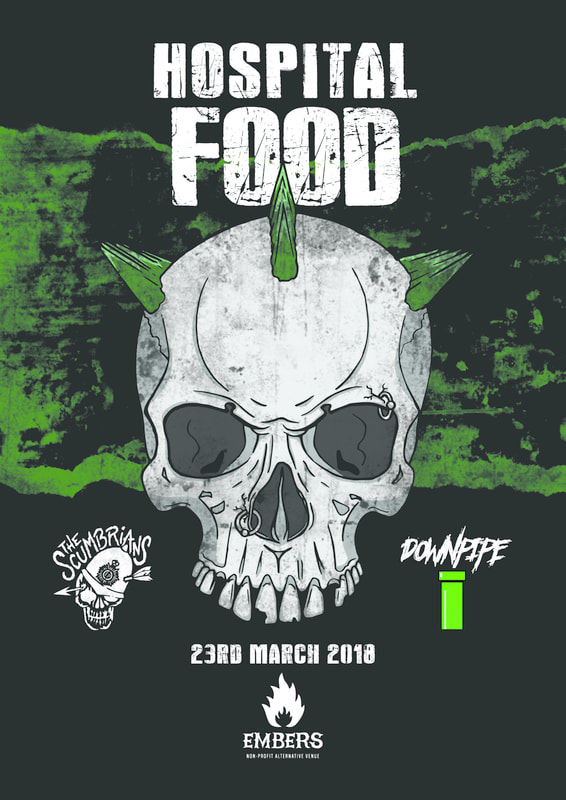
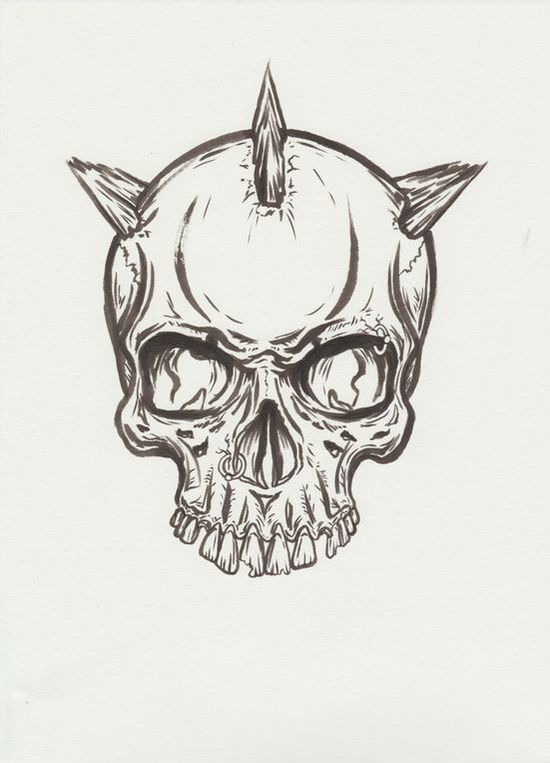
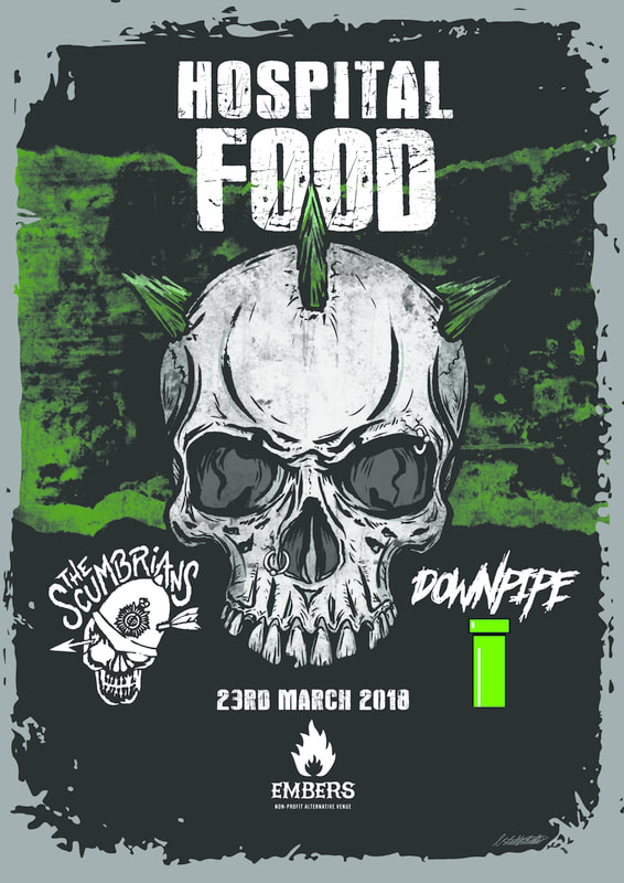
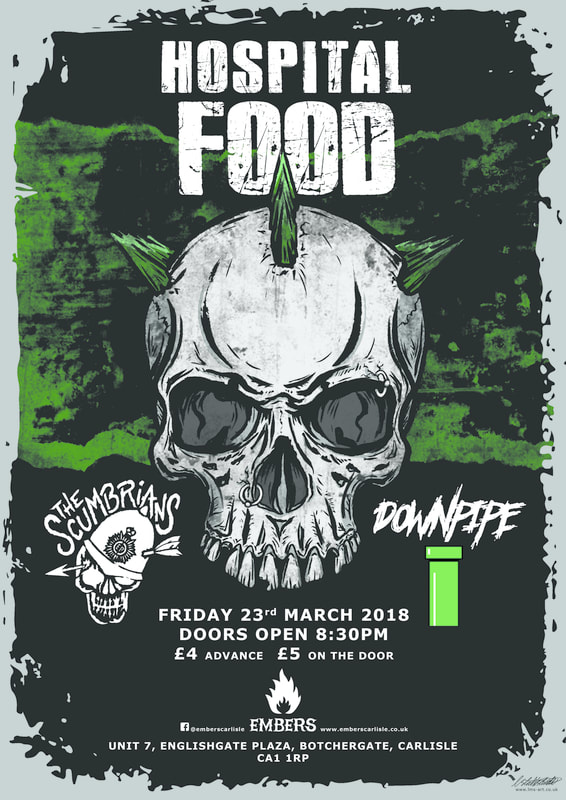
17/10/2017 0 Comments Gig Poster CommissionYesterday night, my boyfriend (drumer of Hospital Food) asked me to create a poster to advertise their headlining event next year. I know these guys, obviously, and I know The Scumbrians relatively well to have already had a decent idea in mind of how I'd carry out this task. I was happy with the concept and I liked the skull itself, but I really felt it was lacking some of that angry punk vibe it so desperately needed. It was far too cartoony. So I got out my lightbox and created a rougher version using a Pentel Brush Pen. And I loved it. From this point on, I was able to create the full poster without any real problems.
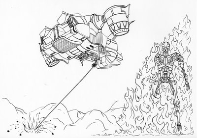
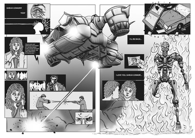
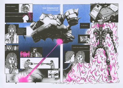
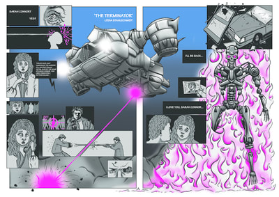
13/10/2017 0 Comments 01: Make a Long Story ShortThis was our first university project of the year and it has only just come to an end. The idea was to create a two page comic spread for the entire movie. I was given 'The Terminator'.
I drew out each piece in ink first and then scanned it all in to be coloured on Photoshop. The sizing and placement of the helicopter thing (I have no idea what it is) and the Terminator needed altered so there'd be a bit more focus on the Terminator. I'd initially drawn it up this way because I felt like the film revolved around its background context within all the flashbacks, etc., but upon reflection after being given some feedback I decided to mess around a bit with the sizing. Overall, I'm fairly pleased with this. It definitely looks a hell of a lot better than last year's attempt (which will not be posted). After adding some silver foil onto the final pieces in the finished comics, I dare say it looks almost good. Almost. |
Contact me here or at info@lms-art.co.uk
All artwork on this website is the property of Lüdia Creative.
Any unlawful usage of this content is strictly prohibited and legal action will follow.
All artwork on this website is the property of Lüdia Creative.
Any unlawful usage of this content is strictly prohibited and legal action will follow.
