|
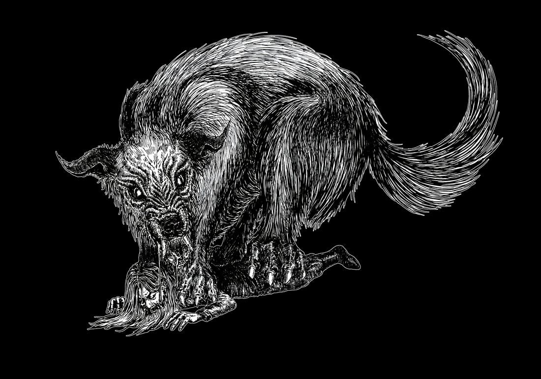
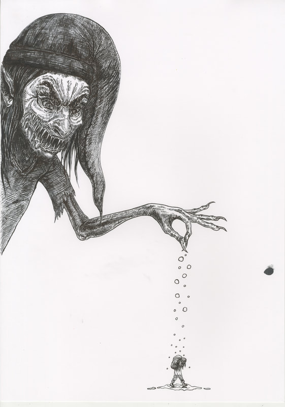
8/12/2022 0 Comments Silver Jewellery CastingI recently made a terrifying step with my jewellery. After working with PMC (silver clay) for so long, I decided to take the next step and get a couple pieces professionally cast in silver. Here are my Krampus and wolf designs in polymer clay... 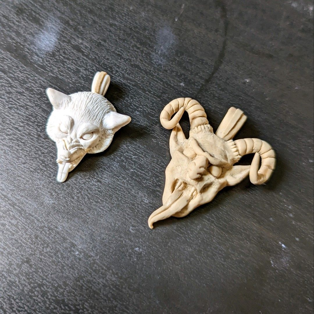 And here they are cast in solid silver... 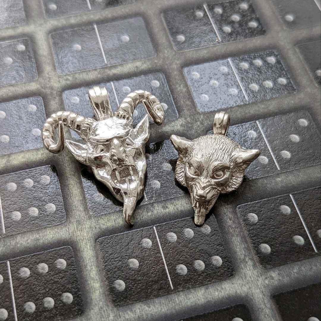 Now to get them finished, polished up and Hallmarked before I can officially put them up for sale!
This was a costly gamble but, if there's one thing I've learned in the past few years, it's that you won't get anywhere unless you take risks. So I've graciously drained a chunk out of my savings account for this and it might just pay off.
0 Comments
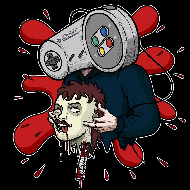
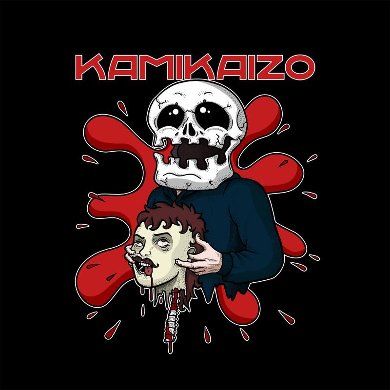
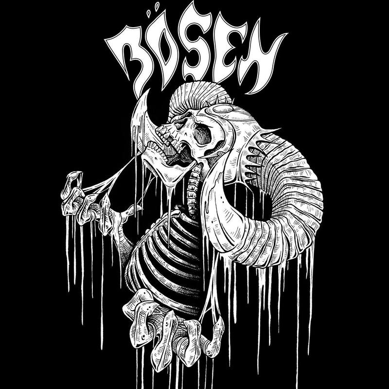
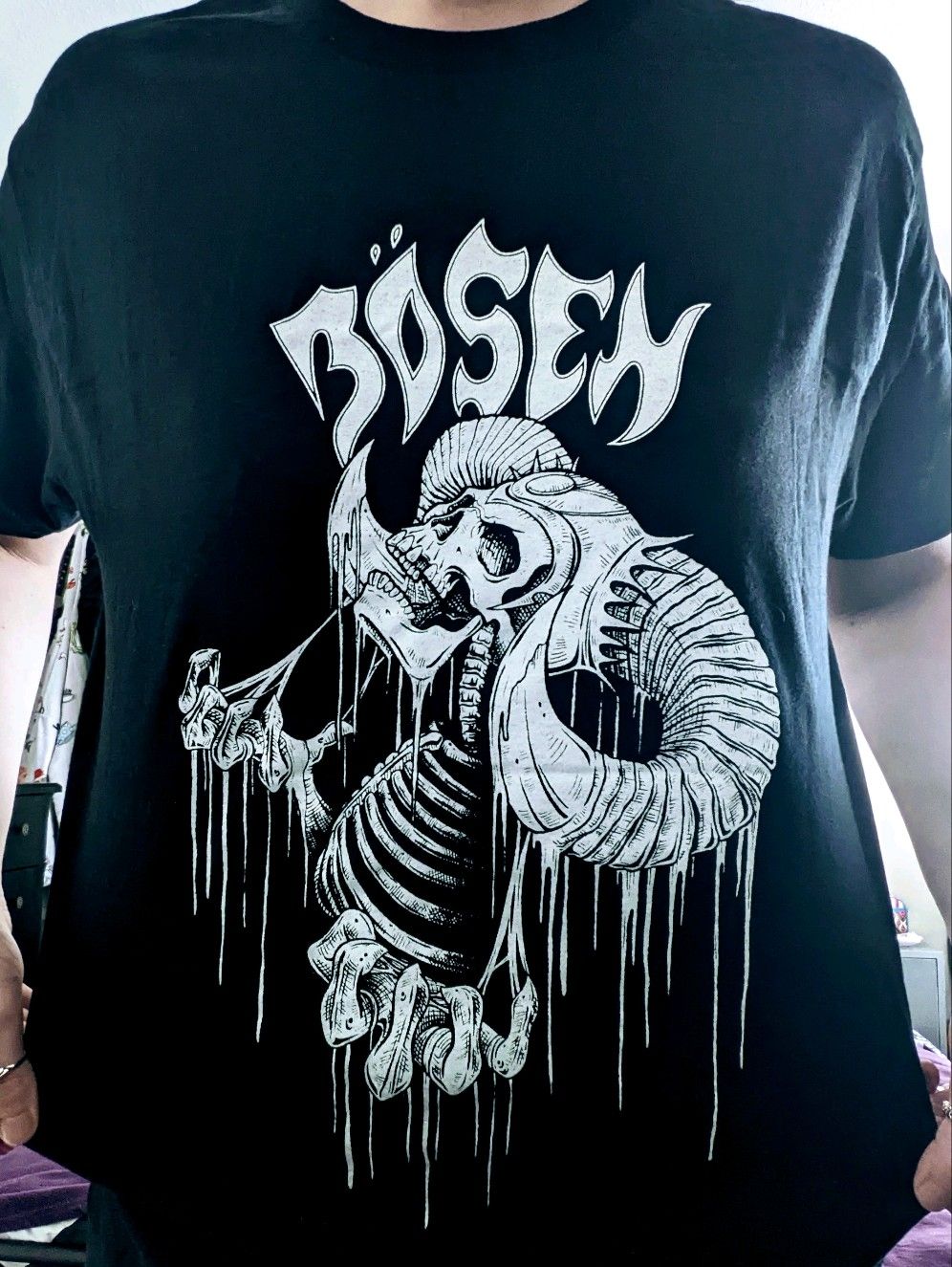
8/12/2022 0 Comments KamikaizoA local gamer commissioned a logo/t-shirt design for his streaming channel, Kamikaizo. We originally went with the idea of an old controller as the large figure's head but, due to copyright reasons, altered this to his Twitch sticker design. Artwork first created in ink pen on paper, then scanned onto my laptop. From here, I was able to digitalise it through Adobe Illustrator and then work into it on Photoshop. 17/8/2022 0 Comments Bösen T-Shirt DesignThe t-shirt design I made for local metal band, Bösen, has finally been printed and is looking very snazzy!
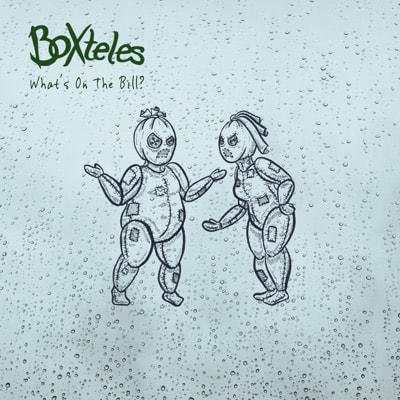
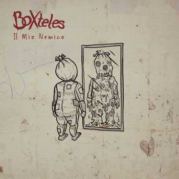
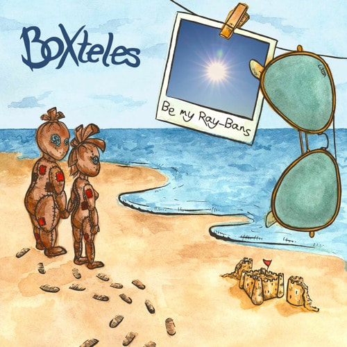
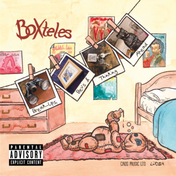
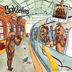
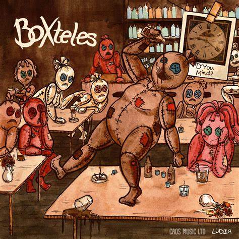
To create this design, I first drew it out in ink and dip pen (always my favourite!) and then scanned it onto my laptop. I used Photoshop to add the white and the logo behind. Incredibly pleased with this print job! 20/8/2020 0 Comments Boxteles EP DesignsBack in January 2019, small Yorkshire rock band called Boxteles approached me to create a unique character design in an unusual cartoon style - completely out of my usual comfort zone -, and a set of three EP covers featuring him. Agreeing to the task has been one of the best decisions I've made. Exceptionally different to my usual detailed ink work, Boxteles' EPs and album covers are a fun breath of fresh air that I consistently enjoy working on, and I quickly grew to become their Lead in Design & Branding. Since 2019, Boxteles has been featured on radio stations, received fantastic article reviews, and has even been shared by renowned actor, Robert Carlyle (best know for his role in 'Trainspotting').
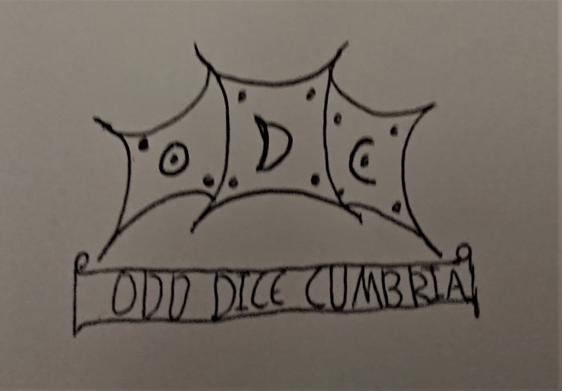
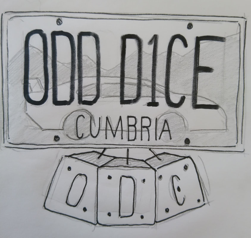
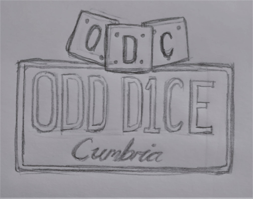
I might be biased here but keep an eye on these guys. They're only going up. Absolutely fantastic musicians and a pleasure to work with. 4/9/2018 1 Comment Odd Dice CumbriaHere we go - something totally different to what I've done before. I was commissioned to create a logo for a car enthusiast group that could be printed as a sticker for their car windows. I was given a basic idea to start with but mostly free reign on this project, resulting in a final piece which was actually completely different to the original sketch supplied by my client (see sketches below). The only specifications I had were to include the name and the dice.
As you can tell by these design ideas, I had suggested the use of an American style license plate as the basic template, which was met with a very enthusiastic response. If you have ever seen American plates, you'll know a lot of them are rather extravagant and heavily reliant on imagery to capture the essence of its state, hence why I included the mountains of our Lake District. I didn't want the imagery to be too realistic so I focused on silhouette styles instead, and eventually came up with this as my final piece. This was fun to make but completely out of my comfort zone and I'd be lying if I said it was an easy process for me. Nonetheless, the client loved it so I must have done a decent job. 11/7/2018 0 Comments Printed BooksAfter the successful funding of my Kickstarter project, I managed to get my book professionally printed on a mass scale. 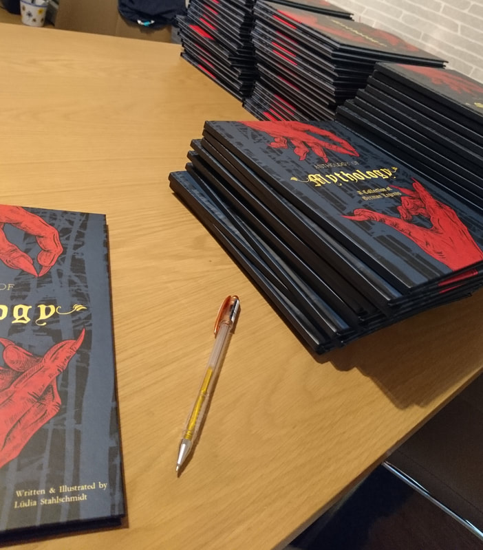 Shortly after shipping out the orders, I began getting some really lovely responses. I don't want to give away too much online - that would ruin the magic. But a few pages can be seen in the run-through of my original, handmade version, found in the previous blog post.
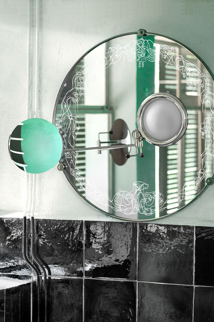
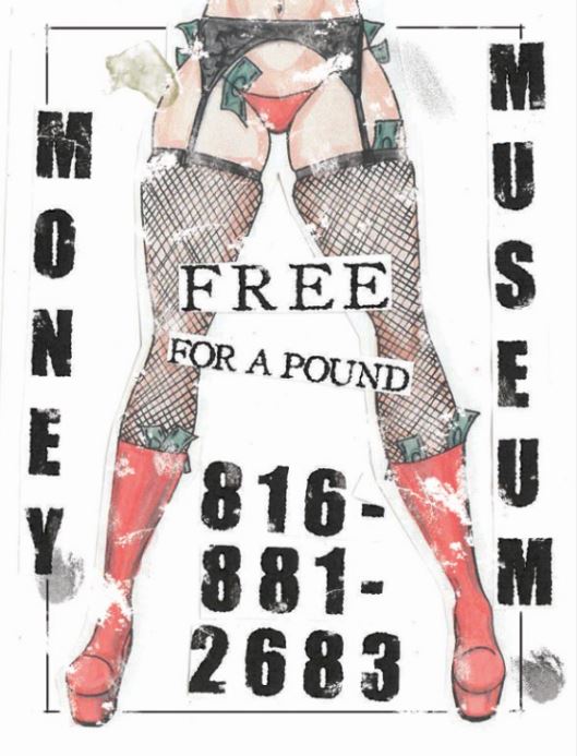
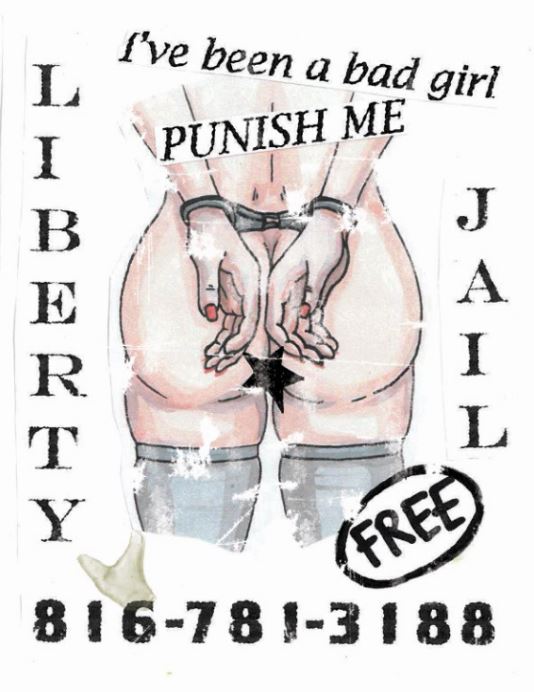
If anyone is interested in purchasing their own copy, please let me know through my Contact page or by sending a message to my Facebook page: Lüdia's Art and Illustration. Books are £15 and shipping costs will vary based on your location. I only accept PayPal. Thank you for reading, and I'd love to hear back from some of you. 6/5/2018 0 Comments Anthology of MythologyNot long ago, I managed to complete my book and handmake a hardback version of it with a screenprinting cover. A friend who knows her photography took some brilliant photos of it, along with my "Paint Your Own Krampus" and Aufhocker T-shirt. A full run-through of the project can be found here: Anthology of Mythology 29/3/2018 0 Comments Final ProjectAs this is such a long project, I don't have much to show to the world just yet. I still have the rest of an entire book to make. However, here's what I've managed to do so far. There'll be much more to come! 22/2/2018 0 Comments Hotel IndigoThis project is a bit of a rollercoaster but I'm going to try narrow it down as much as possible. So, the brief was to choose a location in which one of the hotels of Hotel Indigo was situated. I chose Kansas City; a strangely charming place with wacky museums and a sleazy underbelly. My original plan was to create a series of mirrors which you would not notice the design of until you looked closer. These designs were for: the Puppetry Arts Institute, Glore Psychiatric Museum, Leila's Hair Museum. I did actually make these and engraved the designs on using a laser cutter (these are just mock-ups), but the idea didn't go down as well as I'd hoped so I began to really invest into my other idea. This looks like a massive jump but hear me out. Due to KC's sleazy side, a suggestion was made to me to incorporate "tart cards" into my idea. I decided to make a little character (or part of a character) for each museum and make it as vile and disgusting as possible. To get the cheaply made effect, I added texture digitally and then printed each element off so I could messily cut them up and stick them on another piece of paper together. I then added horrible stains (made with a hot glue gun) and hairs. The final pieces were printed on a Riso printer onto coloured card so they'd be extra tacky and unpleasant to look at. I am actually quite proud of how these tuned out. 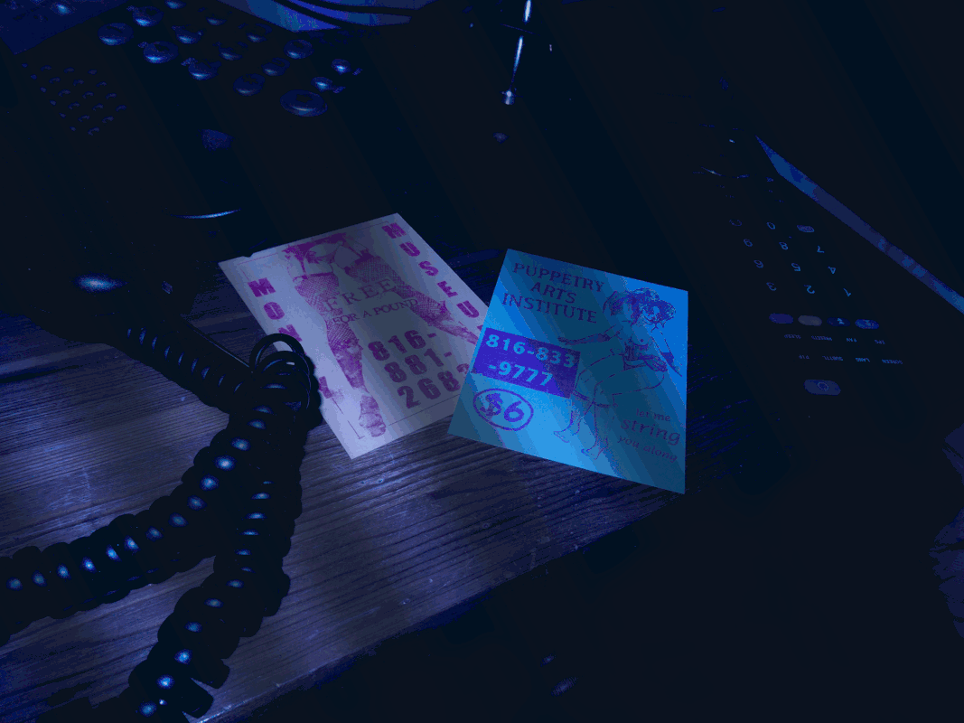 29/1/2018 0 Comments My Traits - CompletedI finally settled on this. I didn't want to take this task too seriously as I just wanted to mess around with the composition of it and have a joke about my bullet points. The obvious choices would have been: "I am always on time", "I can work in a team", etc. But that's boring and should be expected of everyone anyway. 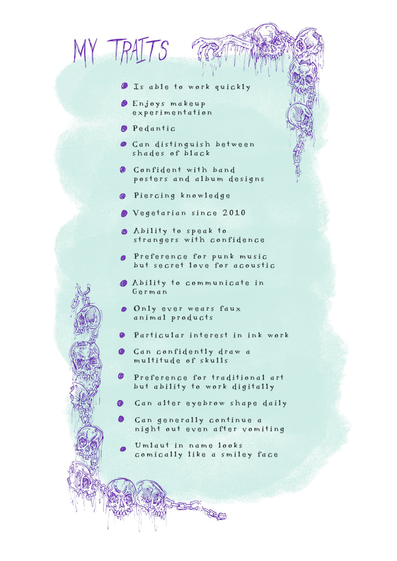 |


Contact me here or at info@lms-art.co.uk
All artwork on this website is the property of Lüdia Creative.
Any unlawful usage of this content is strictly prohibited and legal action will follow.
All artwork on this website is the property of Lüdia Creative.
Any unlawful usage of this content is strictly prohibited and legal action will follow.